Here are some graphics and headlines with some of my comments
which can help answer questions you might have about yours.
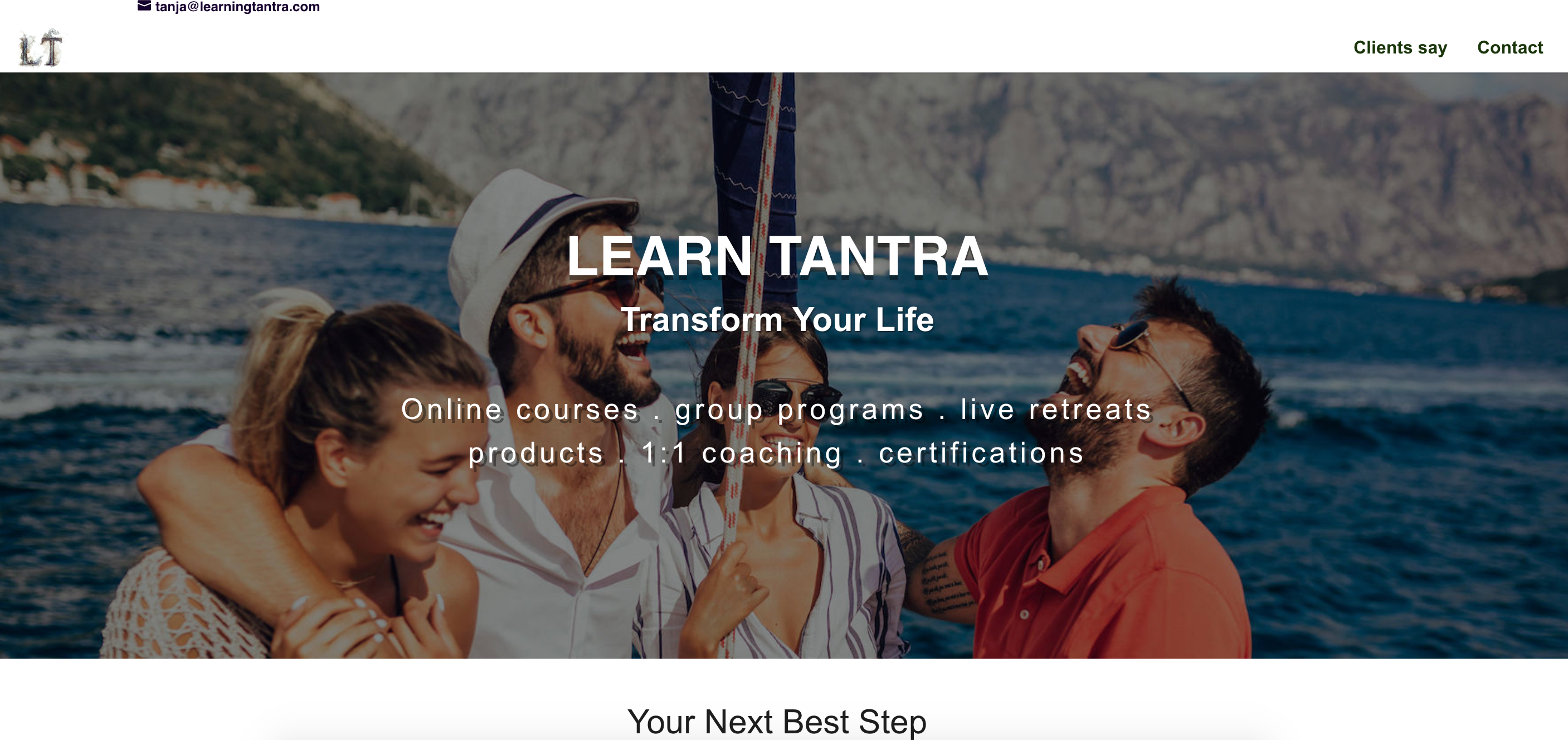
This is actually one of my new sites I’m working on. For best practices (2021) I am going to move the call to action into the graphic and put all the other top bar navigation buttons on the bottom of the page.
I really liked the message the graphic conveyed. It’s important that your graphic depicts the transformation you want them to have. Attractive women smiling is always a hit.
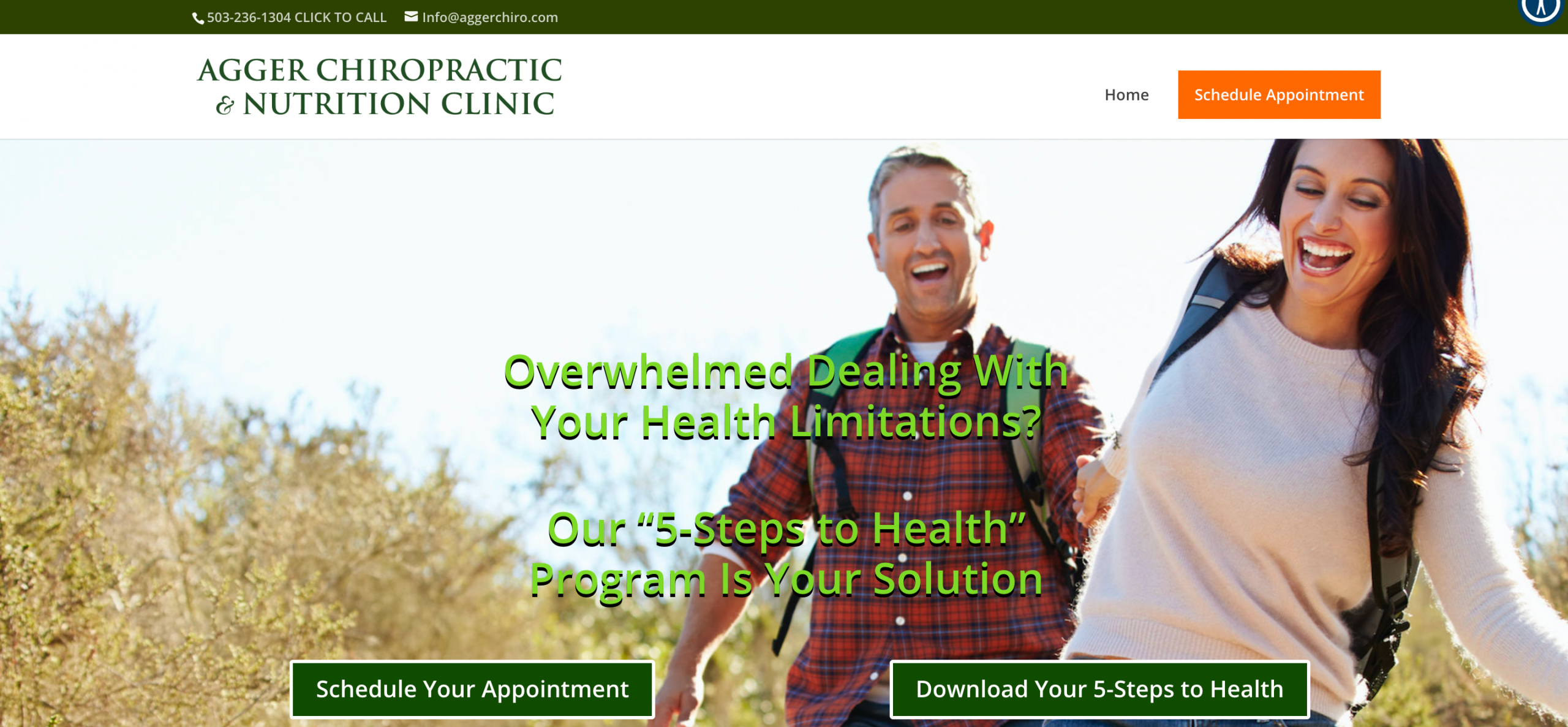
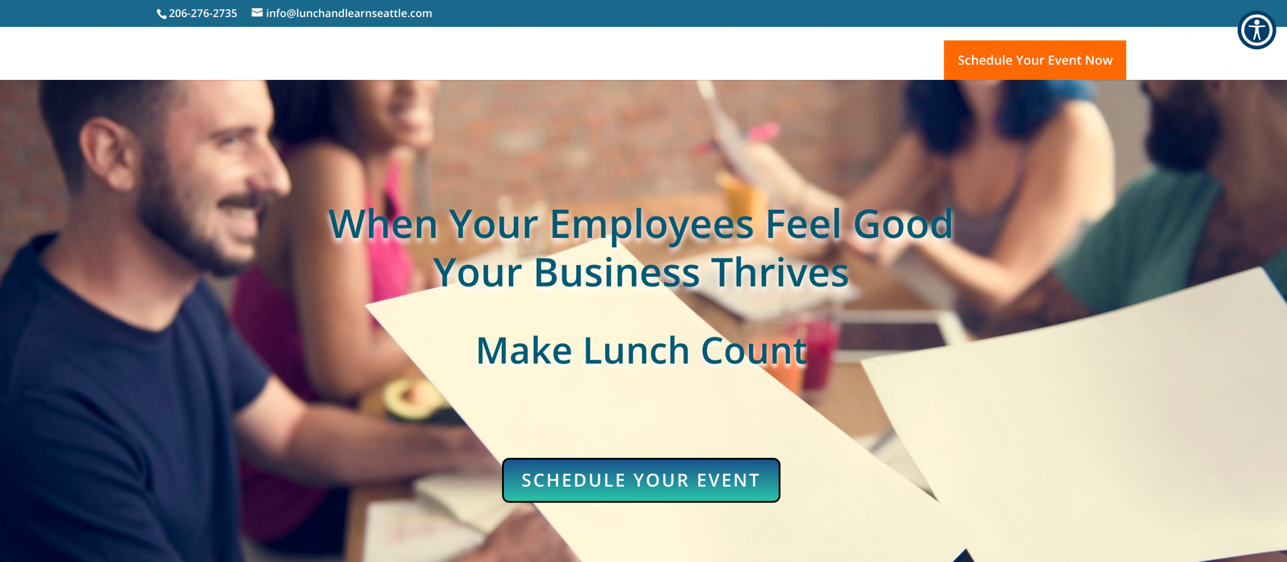
For Lunch and Learn I wanted to keep the headline short and pointed. It’s what it’s all about.
I went for this graphic because typically people finding talks or lectures boring. I wanted to emotionally change that feeling.
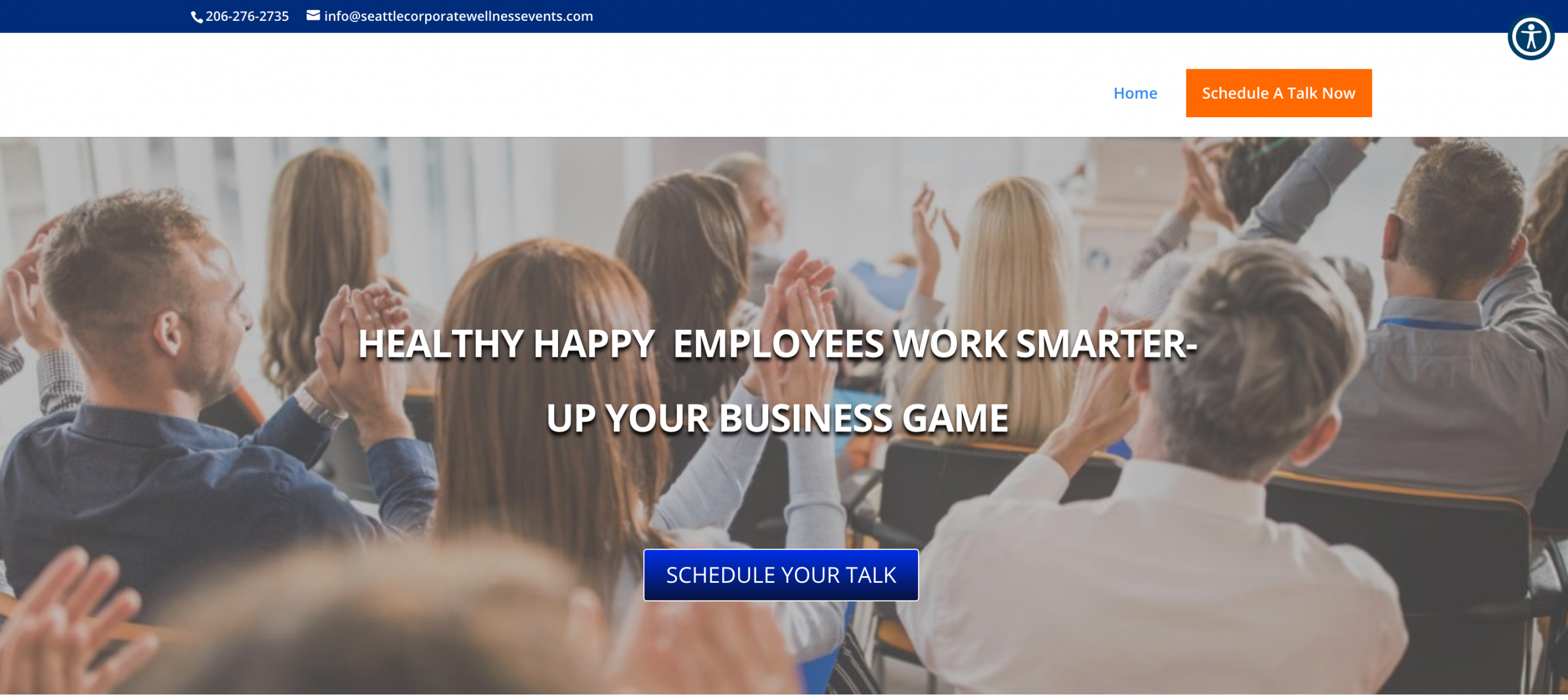
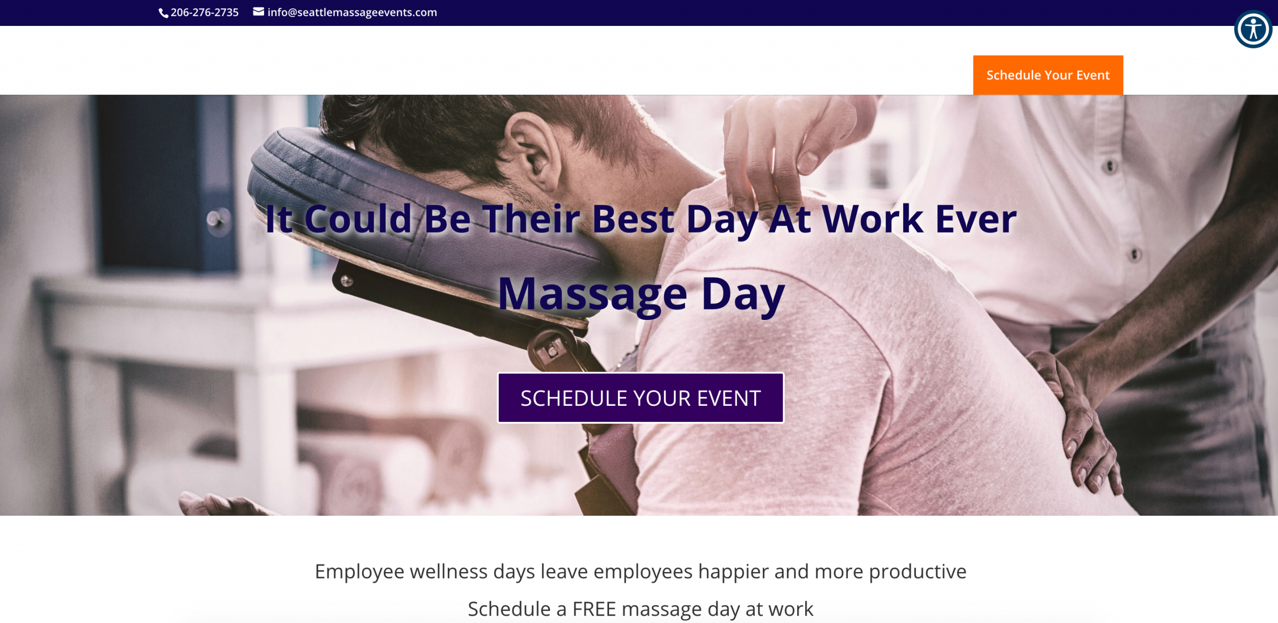
Transformations sell. If you can feel this happening to you, then you want it. People buy largely from an emotional position.
This headline is longer than some of my others and I’m going to be thinking about how to say the same things but shortening it. Even when I’m done with my sites I may revisit and ask to make changes.
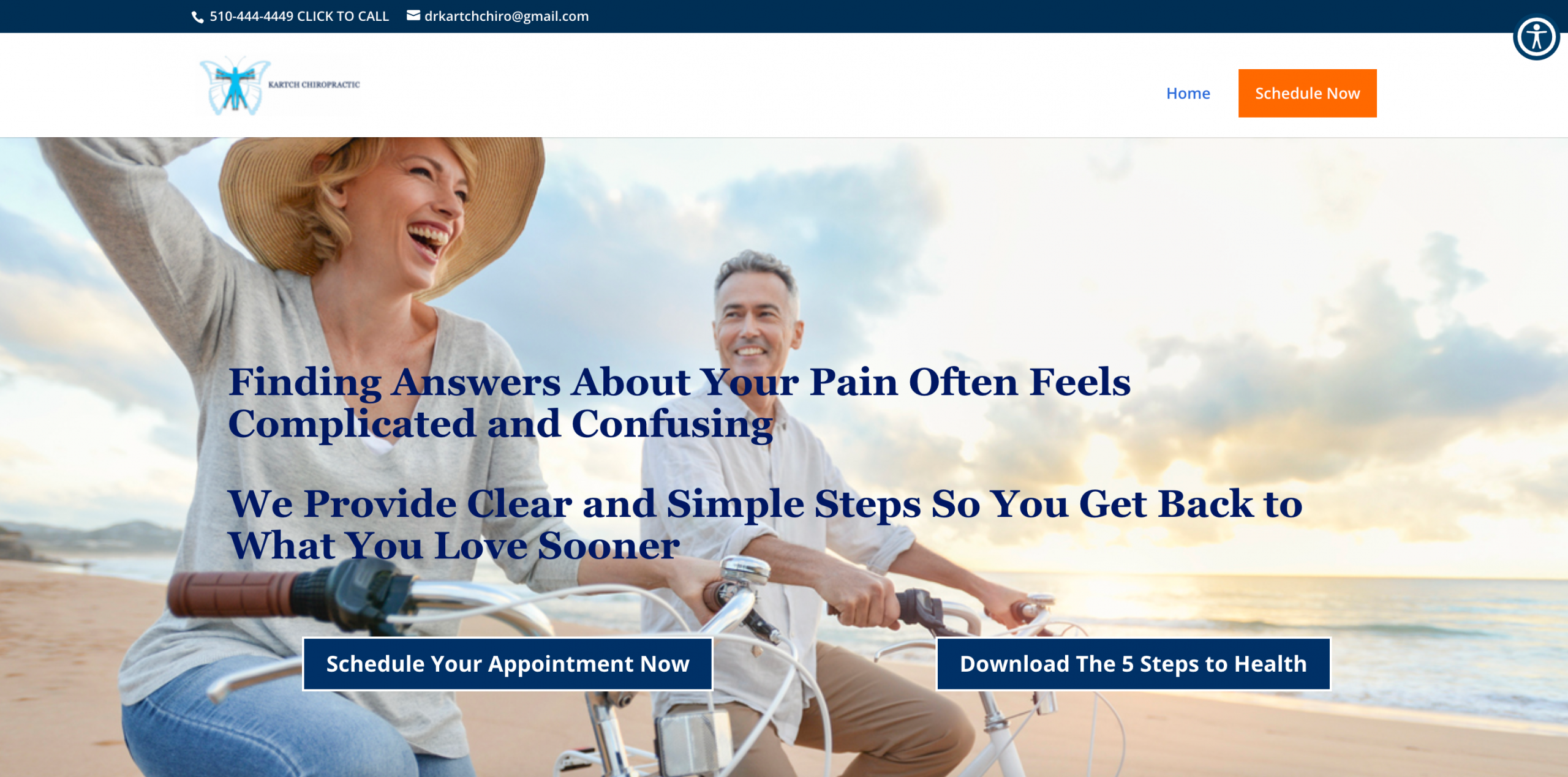
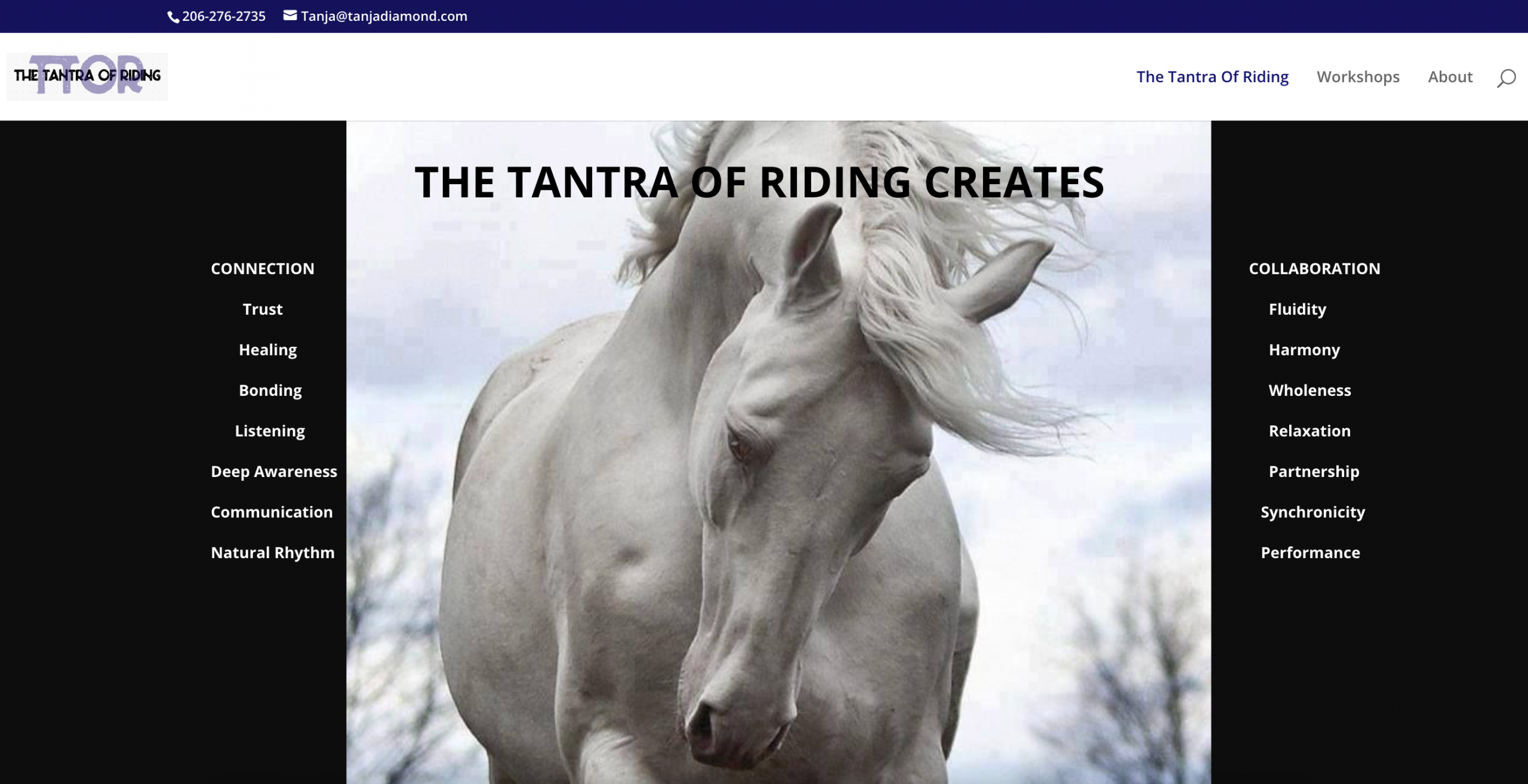
Another one of my personal sites. I am struggling with what my clients do. Getting a clear message. So much easier when I do it for you LOL!
I loved the message here and the graphic is strong. It’s great when you can provide tangible figures on headlines.

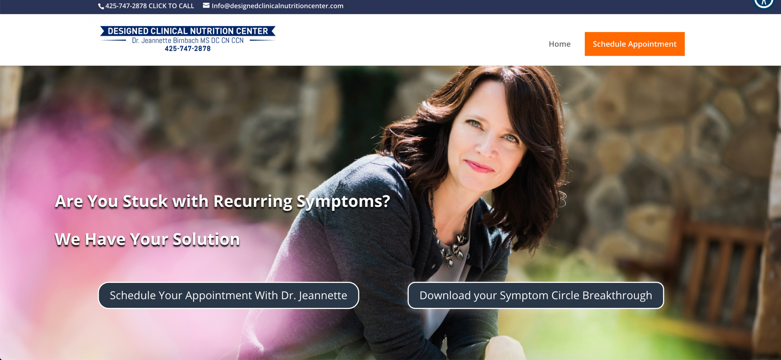
Sometimes you get fortunate and you can use the client’s photo on the front. It doesn’t happen often and I am not afraid to let you know the truth.
I also really enjoy how the logo fits on the site.